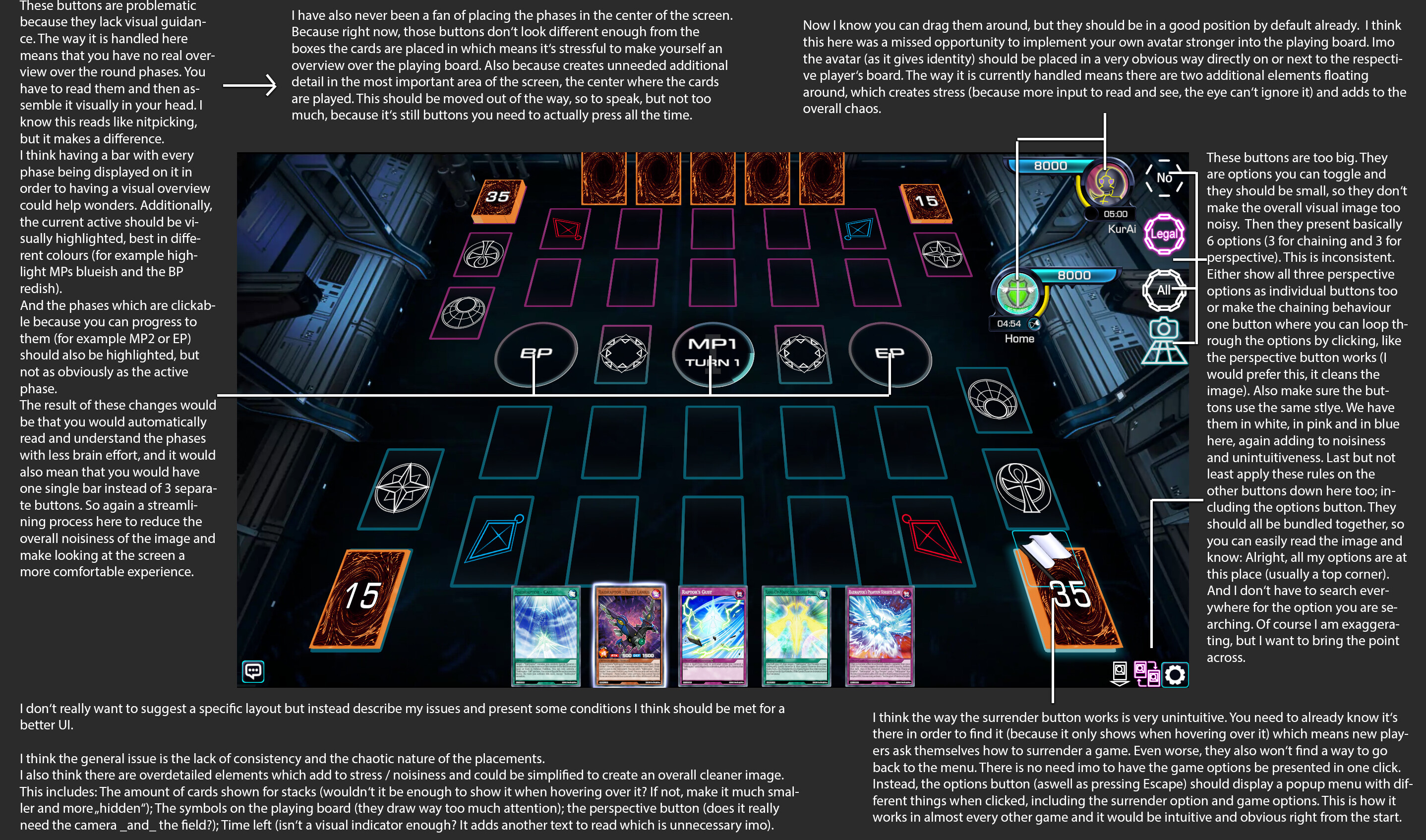
Ok so there’s a lot of stuff to swallow here so I’ll address each thing one by one.
-
Phase buttons - The vertical arrangement of phases on the side has been done before. We did this for ygopro2 for 4 years. The idea was exactly what you stated - to remove the noise from the center and put the buttons on the side. It however ended up creating more problems. When you vertically stack multiple buttons on the side, the space between each button is little. The size of each phase button is also small. This increases the likelihood of misclicks even more. The other issue is that the user has to now exert effort to move their mouse a distance from where it is (the center) to the side and then carefully click on the phases.
I have used both methods and I find it much faster and easier to have the phase buttons in the center since that’s where the action is already. The issue was that when MR4 arrived, the EMZ interfered with the phase buttons. Every game used to have a button for each phase and this caused it to be very crammed. Anything crammed will lead to misclicks.
Our idea was to reduce that tight packing. You will notice that always there are only 3 phase buttons no matter what which was an idea introduced in Duel Links for mobile compactness. The center phase button is always your current phase. This is also why we don’t need to highlight or color the current phase because that is what is in the center. In terms of moving to the next phase when you are clicking, there is already a hover state.
By having only 3 phase buttons, we can make them bigger, each in a circular shape because that works with a touch of a finger. This is because omega is also planned later for mobile. Now imagine using your finger to touch a phase button on the side of the screen that’s vertically stacked. Even duel links did do the phase button on the side, but they don’t have MP2, so for them there’s always only 2 choices - BP or EP.
The click and hold on the phase button adds another way of verification so that the player does not accidentally misclick. This often happens when people are in a rush or losing patience and so they are clicking multiple times on the same button. Since we have the 3 phase button layout, it also means that if you repeatedly click on BP too fast, you risk the chance of accidentally clicking on MP2 after BP. That is why the cooldown is added and it works very well. Many players like it.
In all, the vertical arrangement of phases on the side has been tried before and it doesn’t work. It’s not better than the current layout. In terms of getting “used” to this, most konami games have always put the phases in the center since tag force and even prior. It feels comfortable.
-
LP bars - The LP bars are free floating because every player has their own preference of where they want to move it to. This creates customizability. Fixing the avatar is not a good thing as it removes that.
Now, I will say that the default position of these LP bars was heavily debated and tried. Initially, it was left and right but then it was confusing as to which player is which. We changed it to top and bottom because it creates more space on the left side for the display card pic.
Later, we will program it so that when the duel starts, the position of the LP bars will auto swap so that your LP bar is always on the bottom.
-
Chain buttons - The chain buttons are absolutely one of the MOST important things on the entire field other than the phase buttons. Automatic ygo sims have existed now for 20+ years and the chain system hasn’t changed too much. The dumb systems are those that always ask after each possible actions. The system didn’t get smart until 2007 with the introduction of Yugioh Online 2. That was when auto chain was introduced. Now, it’s much more complicated as the player can bluff with All Chain even if they have no response, use auto chain, legal chain, or no chain. The user always needs access to be able to toggle these chains throughout the duel.
You are right that people can use hotkeys, but hotkeys don’t exist on mobile. The mobile user has no mouse or keyboard, so they must use their finger to quickly toggle chains. Therefore, these buttons must be on the screen. They aren’t just for visual indication but they are big because the user needs to be able to click it sometimes. I use ASD to toggle but there are times when I am chatting with my opponent. While chatting, you cannot use your hotkeys for toggling. Hence, in this case, you use the mouse to click.
You are trying to solve a UI design problem by reducing the size of UI elements in order to make the UI look cleaner. Basically, your argument here is that there’s too many things on the screen - information overload. The solution is not to reduce the size of the elements because then that creates more problems of access. You have to also think in the perspective of mobile and touch.
Bundling together things also creates more opportunities for misclicks.
-
Surrender button - Since yugioh was created, the standard way to surrender in real life, is to place your hand over the deck. That is a sign of surrender. This was carried over to official konami games later by clicking on the main deck, it prompts for the surrender.
Alternatively, you can also just press ESC and surrender that way. That’s not a problem. It is definitely not unintuitive to expect an action that is already used for several years and is actually part of the actual rules of the game.
Overall, you need to understand UI design is like cleaning your room. The room looks clean with less things in it. That is why when removing information from the visible screen, it removes options for the user to process. Less things for the brain to think about makes it more comfortable to interact with right? Yes, but we cannot compromise function for form. The solution to UI design isn’t to make things smaller or to simply remove them. It’s how to organize and arrange it. The information has to be presented, but how we present it is the question.
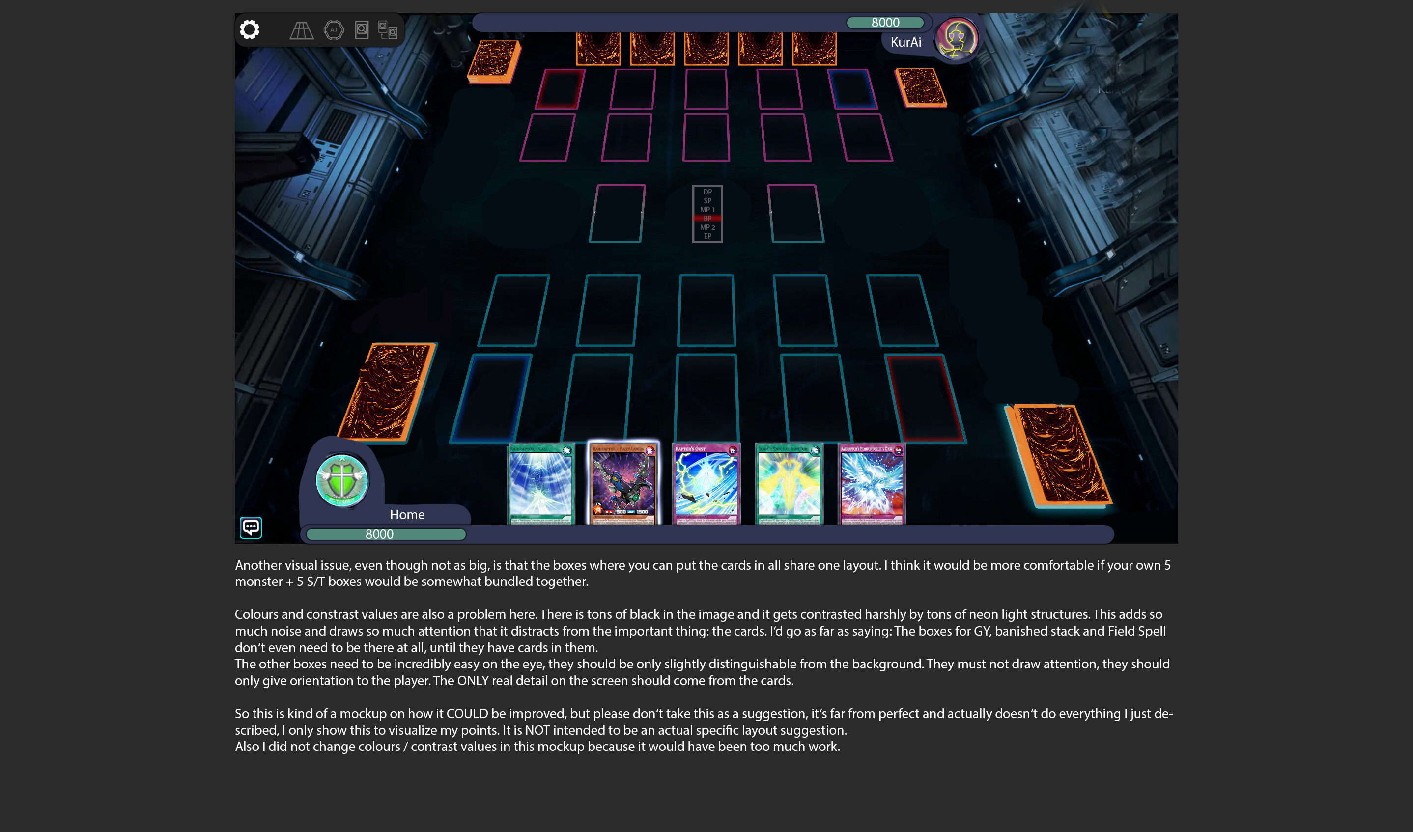
I forgot to reply to the second image you posted.
-
Zones - There is indeed space between each zone because there are elements around the card that we add. This includes things like counters. We also have monster holograms so we don’t want those to be overlapping with adjacent holograms. That extra space also helps make it less crammy.
Even if a zone is empty, it must always be shown to the user. This is again important due to strategy and many other things. In real life, you have a playmat that looks identical to this field. Generating a zone when it’s non-empty and making it disappear is actually more confusing for the user. It’s best to see the whole picture and then make decisions accordingly with the information present, not with elements disappearing in the middle of a duel.
You mentioned colors and contrast. All of that is customizable. You can change the default background simply by putting your own png in the backgrounds folder. You can change the shape and color of the zones too. People have created their own themes for different contrasts. We use black as the background for default because it does contrast well with the blue and red zones to distinguish player and opponent. It also is consistent with our cyber theme.
I like your mockup but I don’t like the phase selection in the center for the reasons I said - very bad for mobile. You can’t tap with a finger on what phase you want from a dropdown like this. This even creates opportunity for misclicks on the pc. I like how you positioned the LP bars. However, the reason we don’t already have that is, because of the code. In a duel, there is a host player who hosts the duel and then the player that joins that duel. The core doesn’t care who is player or opponent. Rather, the host is always Player 1 and the other player is Player 2. In ranked, this is randomized. So it is not easy to position the LP bars to make it correspond exactly to what the players are.
As I said, your mockup for LP bars is good, but this also creates a restriction for other players who don’t want it like this and want to move the position. The LP bar does not need to be this wide. Also in your mockup, you moved the extra deck upwards to make space for the LP bar. This isn’t good for when the Field Zone is activated, then the Extra deck moves down. The goal here is basically to have the LP bars closer to the hand which I agree with but not the way you have shown.
I do like your toolbar that you made on the top left. That can work if it expands and collapses which will work on mobile and is a great way to reduce space without reducing information.