Hello i just one to give you some ideas for the Dev Team .
1.The card and description can you use the same idea that the Yugioh official online games years ago
is clean and easy to see for the user,this should be automatic ,the user should not click in the chat button or info button ,should be opened automatic like the official yugioh online game.
2.Some animation for the syncro,xyz,pendulum,fusion.
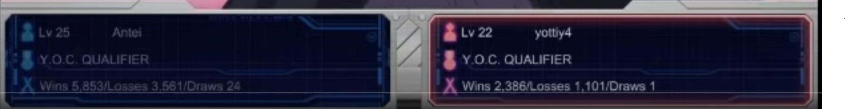
3.All the users in ranked should see the name of the opponet because appears in my pc like username and in the chat appears the real name.
4.You should make Sleeves for your decks and cards but make it pay for get this type of costume,can help the Dev Team for get some sustain with that money.
5.You maybe in the future can add an avatar like the yugioh online official game
I wish the best in this game is a really big improvement for a yugioh online game
Add the picture of the point 1,3,4,5 something like that
I beta tested Yugioh Online since 2004 and played all the way up to 2012 when Yugioh Online 3 Duel Accelerator got shutdown. I am very familiar with the game and it was one of my favorite games.
This whole concept that exists in all ygo games with a permanent chat box that is not resizable or collapsible is outdated. Now, the game is in Unity and the card quality is so good that you can read the text from the card itself. Modern games like MTG Arena don’t have any card text box on the side. This card text box takes 1/4 of the screen width. We want players to learn to click+hold on the card to zoom and read it. This makes it perfect for mobile where the screen space is very small. If you notice the design of the chat box in Yugioh online also has tabs. It has a log, card text, and other things. You can resize the display as well and pull up the chat box.
If again, you want that layout, just change the view, resize the display pic and resize the chatbox the way you want it. It will remember all those positions and sizes and keep it for your game.
So in Yugioh Online and the Tag Force games, those summon animations pause the game to play those animations and it takes the full screen. This causes a delay in gameplay. Our summon animations are async. That means there is absolutely no delay or pause to play those animations. Whether or not you turn off the animations, the gameplay is seamless without pause. This is also what modern card game simulators like MTG Arena and Hearthstone do. In the later stages of Yugioh Online, players clicked to skip those animations so that they could continue with their combo and not slow down the gameplay.
It does show the opponent’s name but this is actually Discord’s fault. We use the Discord sdk to retrieve the avatar info and soemtimes the Discord sdk doesn’t send the info correctly. We’ve already told Discord about it. Their sdk is new just like our game is new.
You pay a one-time donation to get sleeves or playmats. We aren’t going to do the in-game shop like Yugioh Online to buy skins and themes. We legally cannot sell anything or do microtransactions.
A 3d customizable avatar is doable but again just not wroth the time over all the other features which are much more important like relay mode, offline ai, and puzzle mode. I used to love those animations like setting a card, summon, activate, etc. using the duel disk. However, people just clicked to skip later.
We are trying to go beyond the regular ygo games. It would be easy for us to copy previous games or just make another ygopro with ranking and hd pictures. We want to make something that will last for the next 15 years or more. This game will keep changing as it is very modifiable and we control the code.
I love your anwser ,i hope the game last for more the 15 years
Yes i just think that the tabs options in the chat are nice but i think should open automatic at least in the pc version,maybe in a mobile version in the future can be optional,but its a little annoying click for get the info of the cards always. Sorry for my english i am spanish native. Well i know we going to have a lot of updates in the future and maybe catch some of my ideas and other ideas that you have.
1,Another idea that can be implemented in the future can by this simplify the interaction with the user,because when i play i don t know sometimes when is my turn or when i can do or do not something.
2. I think i find a bug when you select a monster card or some card you can t cancel the action,in this case if i don t want to put a monster in normal summon but i already selected the card i can t cancel it
I am learning Unity for help someday the DevTeam if they want some help
1.Image of suggestion of point 1
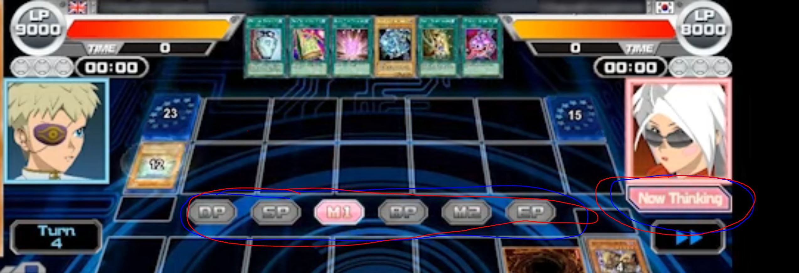
Instead of writing the words, “Now Thinking”, you know whose turn it is simply by looking at the hourglass. That’s the same thing as they are thinking or waiting. Remember that this game is translated into 12 different languages. Each time we use words, they have to be translated again into 12 languages.
Also, “Now Thinking” takes space on the UI. This game has to be condensed in preparation for mobile.
As for showing you the statistic of the player you are going to match with - this actually is not good. In a accurate ranking system, players should be blind towards the rating of their opponent. Whether or not they have 1000 wins or 0 wins, the opponent should be treated the same. In Yugioh Online, the “level” did not mean anything. The “level” was given based on number of duels. The only thing that meant anything was wins/loss. You could have a Level 1 player with 10 wins who is actually hiding his true skill so they created new accounts to do this in YOC. People who played Yugioh Online pretended to be Level 1 when they are pro in order to fool their opponent.
Remember we take ideas from Yugioh Online, but we do not need to copy it. Rather, we have to find better ideas and improve.
That would make sense we if would not have the anime card layout, it looks sick it gives nostalgia but there’s no text. and even with medium longetivity text needs scrolling on the card with og layout sometimes and I haven’t even played anyone who uses pendulums yet.
I’ve been trying to do that since day 1 of open beta and I either see everything(card text) and it blocks field spell zone and extra deck, or I need to scroll a lot, you can’t even put it anywhere else because then it would block either the opponnent or your field.
It’s all nice that you want to innovate but if something is not broken don’t fix it.
Yugioh has over 10k cards some with such a wall of text that you don’t even want to read it.
Since its automated its fast too so you don’t even have time read every card that is played. And with this “challange” to read cards its not pleasant.
that little card text box is very crucial imo and should look as always.
But anyways its your project you do whatever you want.
There’s a new update coming soon. We changed it so that the card text orientation is from top to bottom instead of bottom to top. This should help a lot of players who are used to reading card text in the card text box. I’ve played ygopro for about 6 years, so I was also used to reading the card text on the side. Even before ygopro, we had Yugioh online which had a chat box with tabs and the card beneath them with a scrollbar.
The only thing that was messed up was the card text orientation. We did have actually a camera view where the field was shifted to the right side so that would give more space for the chatbox on the left without blocking the extra deck. We had removed this to add the new centered view instead. Later, we can add it back which is essentially the “Classic view”.
In general, the idea of “Don’t fix it if it’s not broken”, will never lead to any improvement or innovation. In engineering, we are taught exactly not to think like this. It’s easy for us to just copy what exists. We can make a ygopro with ranking and hd pics in a week but we spent 1 year to make this game from scratch because we aren’t satisfied with the way things work now. MTG Arena is also another modern simulator and it broke many pattterns and tried many things. There’s no permanent card text box in MTG. They hover over the card and see the text. We liked this because it allows the full screen width of the field. In other games, that card text box can take up to 1/4 to 1/3 of the screen area.
I think your improvement its nice ,i love your project and the dedication you give to him,trying to be honest make a copy of Yugioh Online is not a bad idea at all, i love it the yugioh online official of konami i know okay the cinematics or things like that can be skipped in this project but the UI in general of somethings was nice i love it, i think you too ,i study engineering in computer science i understand your point of view in somethings but try to talk with the people and get suggestions and with your dev team too,i know you can do what you want and make the game with your own ideas but try to think in the future this can be your job get money and other stuff.
The only think i am trying to say if the Yugioh online official of konami was good in some things copy it and in others try to improve or make votes in discord chanell with the community for get some ideas.


 or make votes in discord chanell with the community for get some ideas.